To borrow a phrase from the movies, today’s data is “everything, everywhere, all at once.” We’re generating new data — piles of it — constantly. But just how useful is your data for critical stakeholders? Sure, it’s stored away, and we can generate endless reports on it, but that’s not the optimal approach to transmit information effectively on a day-to-day basis. So let’s go over how you can add charts in Oracle APEX.
We want our users to be able to quickly identify and work through meaningful data, so they can make consequential decisions or identify problems before they become trends. To make that easier, we’re going to take our data and create a chart that updates whenever the data changes. Then, with just a quick glance, our users can understand what the data really mean.
I’m going to take you through how to put together a quick chart in Oracle APEX. As Oracle APEX developers, we admit we’re biased, but the built-in chart functionality in APEX makes it much faster than building one from scratch — and pulls data directly from your Oracle database.
Let’s start by creating a new region on your APEX page, and then click the “Type” menu and select “Chart”.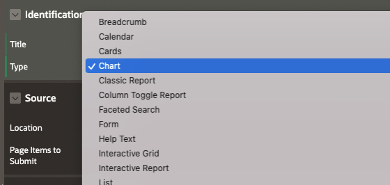
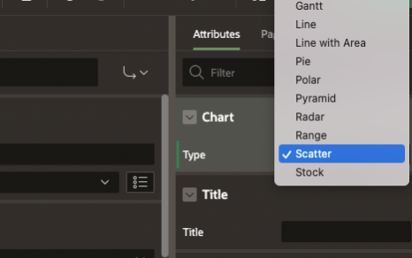
Next, we’ll navigate over the Attributes section and look for the Chart heading. There are currently 18 types of charts built into APEX. For this demo, we’ll be creating a Scatter chart.
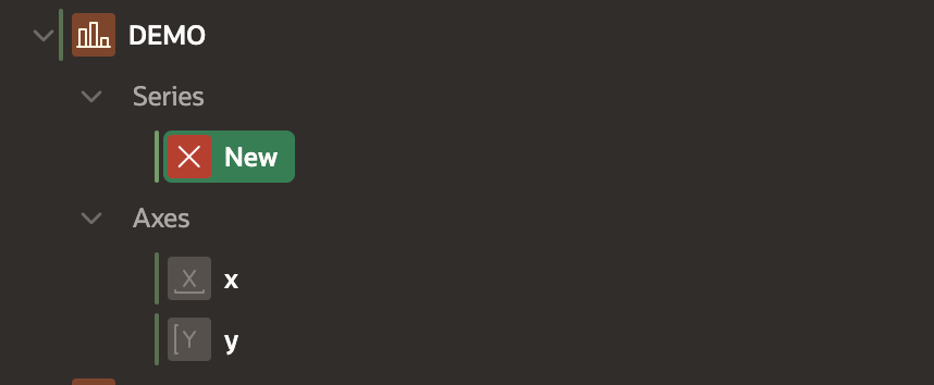
Under the rendering tab you’ll see a couple of new subheadings. We going to focus on Series which is where you select the data points you want to chart.
 You can select your data directly from a Table/View, SQL Query, or Function Body returning SQL Query. In this example, I’ll be using an SQL Query, because it will allow me to assign a Tooltip which will provide users to additional info when they hover over a data point. It will also allow me to pull in values from page items such as a user selected date range.
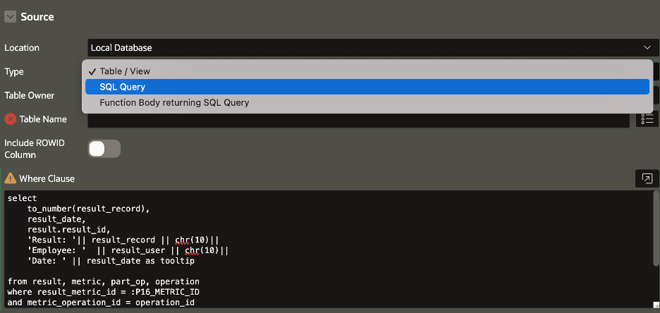
Here’s the SQL query that you can copy and update for your own data tables:
 select
 to_number(result_record),
 result_date,
 result.result_id,
 ‘Result: ‘ || result_record || chr(10) ||
 ‘Employee: ‘ || result_user || ‘chr(10) ||
 ‘Date: ‘ || result_date as tooltip
 from result, metric, part_op, operation
 where result_metric_id = :P16_METRIC_ID
 and metric_operation_id = operation_id
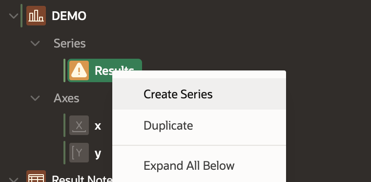
For this example, I’m creating a quality control history chart that shows a measured result and where it fell within the tolerance range. This will require multiple Series which can be added by right clicking under Series.
The last step is to assign titles to your X and Y axes. Then we’ll be in business.
Now we have created a chart that shows the tolerance ranges for a QC check and the actual results allowing your users to quickly identify trends and address them much faster than reading through reports.

Charts like this are critical parts of successful enterprise application development. They’re often useful for dashboards and other business intelligence applications. Anytime you want to present or analyze large amounts of data, charts are a good way to give your users at-a-glance insight. And Oracle APEX makes creating them exceptionally easy.
Need help connecting the dots on your enterprise data? Contact Traust today. We’d love to help make your business more intelligent.


